Three architecture studios complete low-cost housing complex in San Francisco
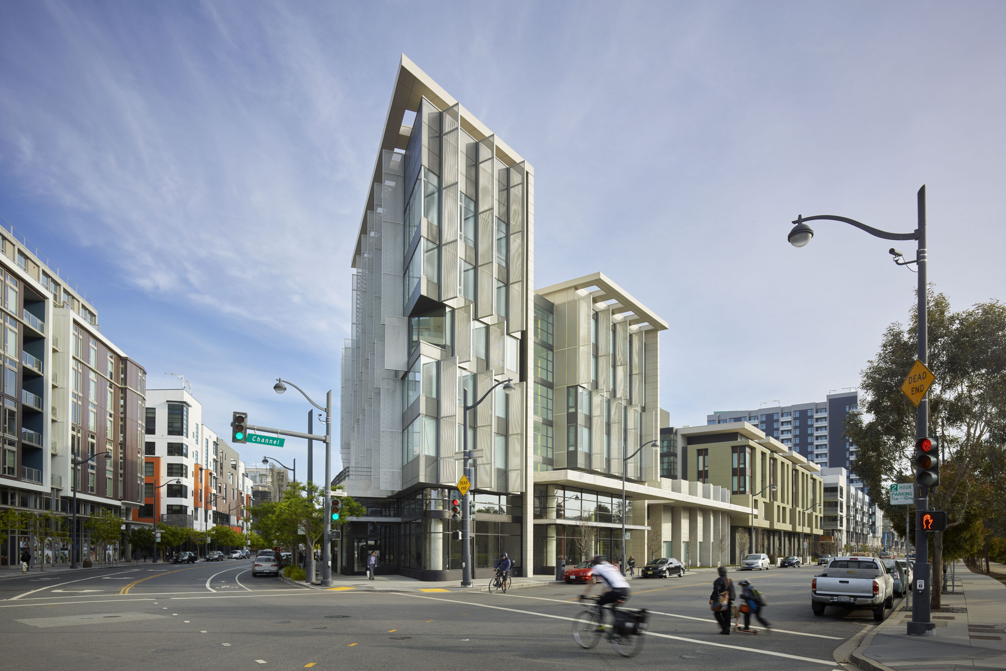
A trio of local design firms teamed up to create an affordable apartment building that occupies a full city block in San Francisco’s urban core.
Called 1180 Fourth Street, the six-storey building was designed by Mithun-Solomon, Kennerly Architecture & Planning and Full Circle Architecture.
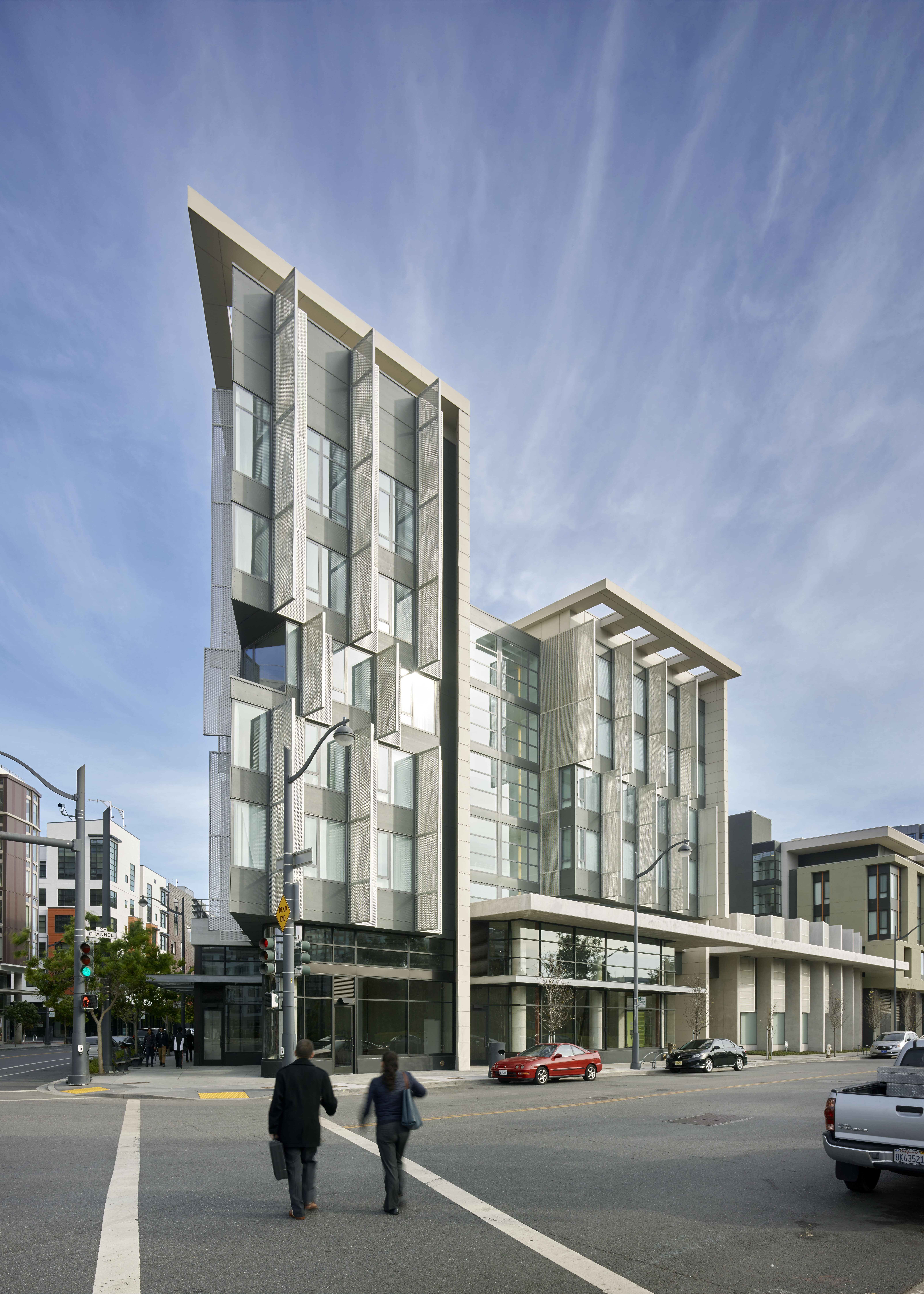
Situated on a pointy corner lot, the building serves as the southern gateway to the Mission Bay neighbourhood, which has experienced a building boom in recent years. The district formerly housed rail yards, warehouse and parking lots.
“This setting carries civic obligations unusual for an affordable housing project,” the team said. “It demands a welcoming mixed-use street frontage with richly articulated architecture to define the character of this emerging neighbourhood.”
Encompassing 216,00 square feet (20,067 square metres), the complex contains 149 affordable housing units for low-income families, including those who were formerly homeless. The units offer either one, two or three bedrooms.
The building features ample communal areas, a parking garage and ground-level retail space totalling 11,000 square feet (1,022 square metres).
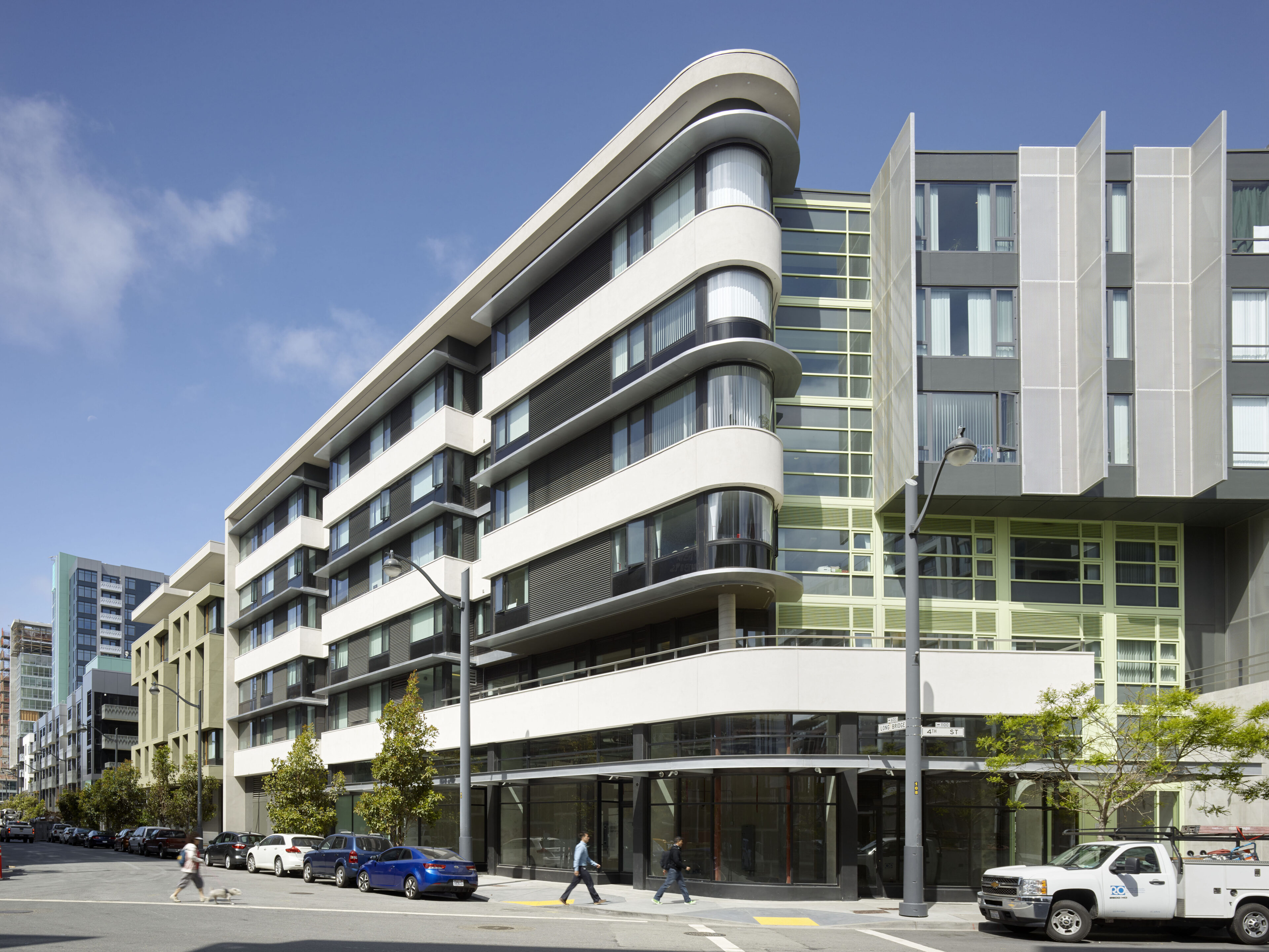
Volumes of varying heights and shapes wrap the carpark and a central courtyard. To give the residential building a “permeable” quality, the design team provided views of the courtyard from the street.
Each elevation is different, a strategy that aligns with “the distinct character of the four surrounding streets,” the team said. Some facades are grey and white, while others have light green accents.
Portions of the exterior are sheathed with metal sunshades that help mitigate heat gain while still preserving views. Horizontal louvres were installed on the south facade, while vertical ones were used on the east and west.
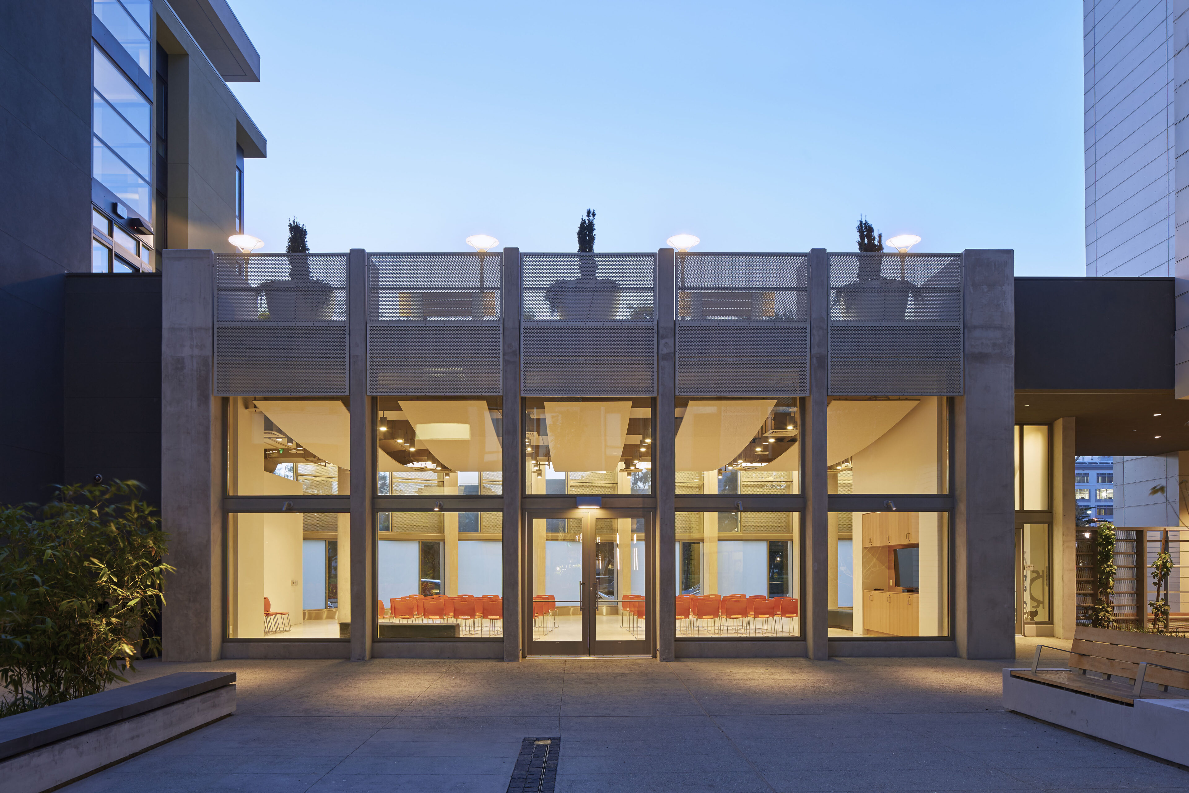
Inside, tenants pass through common spaces and corridors filled with natural light. Shared areas include a teen room, computer lab, fitness centre and a glass-enclosed meeting room.
Decor in the communal zones includes felt wall hangings, contemporary seating and end tables made from tree trunks. Apartments feature large windows and wood flooring.
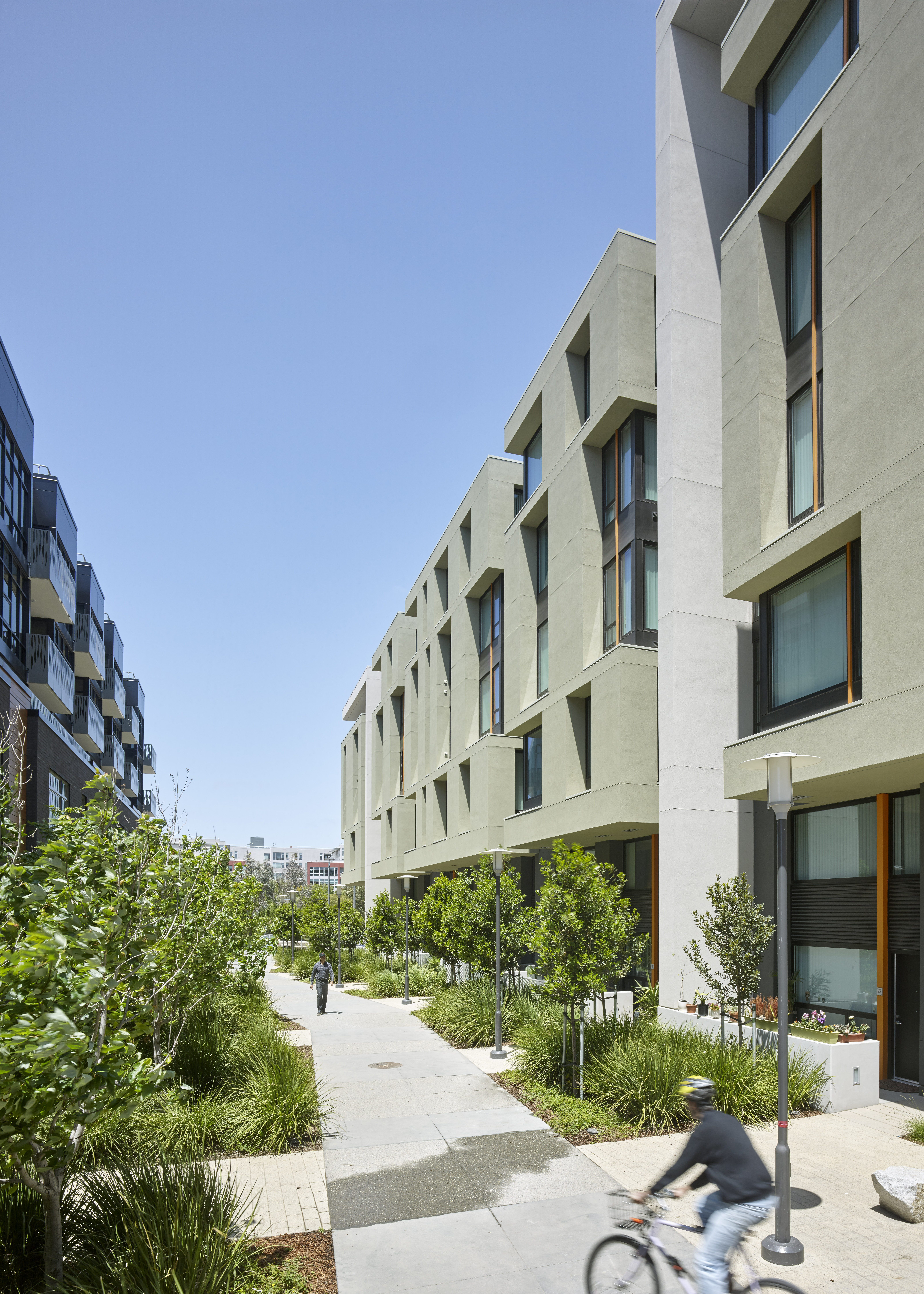
The team integrated numerous outdoor spaces into the complex, including walkways lined with planters made of weathering steel. The central courtyard features a turf field for sports activities and film viewing, a barbecue area, garden plots and a secure playground for children.
Read the full article, which appeared on dezeen’s website on July 21, 2016